Entry #029: How to Read Your Power-Duration Curve, A Scientist's Walkthrough
The power-duration curve compresses your entire cycling physiology into one line on a chart. Six seconds, three minutes, an hour: every duration tells a different story about a different energy system. Once you can read it, you stop guessing about training.
That's the promise. Most riders never collect on it.
This walkthrough goes deep. By the end you'll know what shape your curve makes, what each segment means, and what to do about it.
What the curve actually shows
Your power-duration curve plots your best sustained power for every duration you've ridden. If your hardest 10-second effort all year was 1100 W, the curve passes through (10s, 1100W). If your hardest 30-minute effort was 280 W, it passes through (30min, 280W).
Connect the dots. Not as a smoothed average, but as a maximum envelope. That's your PDC.
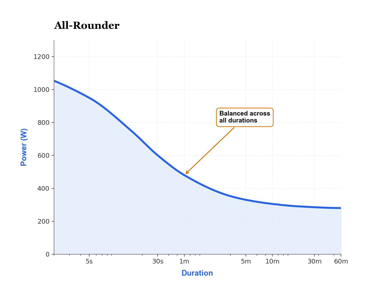
The curve always slopes downward. You can hold more power for ten seconds than for an hour. What matters is the shape of that slope. Where it's steep. Where it flattens. Where it turns over.
The three regions every PDC has
Every PDC has three physiologically-distinct regions:
1. Neuromuscular (≤ 15 s). Sprint power, muscle contractile force, anaerobic alactic system.
2. Anaerobic / VO2max (15 s to 6–8 min). Anaerobic glycolysis plus aerobic capacity.
3. Aerobic / threshold (8 min and longer). Sustainable aerobic power, dominated by mitochondrial capacity.
The transitions between these regions show up as visible inflections in the curve, and on a well-sampled rider's chart you can usually trace two clear "kinks" with a fingertip, one around 30 to 60 seconds and another around 8 to 10 minutes, marking the precise places where one energy system hands off to the next.
How critical power lives in the curve
Critical power (CP) is the asymptote of the aerobic region. It's the power you could theoretically hold forever if fatigue from anaerobic sources didn't accumulate. Forever is theoretical. In real life CP is roughly the power you can hold for 30 to 60 minutes.
CP isn't an arbitrary line. It's a real physiological inflection where your body shifts from using a finite anaerobic store (called W-prime, or W′) to relying on aerobic capacity alone.
Above CP, every second you spend depletes W′. Below CP, you can recover indefinitely. Two numbers. Most of your endurance physiology, captured.
What W-prime tells you
W′ is your anaerobic work capacity, measured in kilojoules. It's the energy you can spend above CP before you have to slow down.
A typical recreational rider has 10–18 kJ of W′. Top kilo specialists can exceed 25 kJ. Endurance specialists go the other way. Their W′ is lower (often 12–15 kJ) because years of long-aerobic training have selected for aerobic efficiency at the expense of anaerobic capacity.
A high W′ shows up in the curve as a bulge through the 30 s to 5 min range. Sprinters have it. Time trialists don't. Most riders sit somewhere in between.
Reading your curve's shape: three archetypes
Every rider's curve falls roughly into one of three shapes.
The sprinter
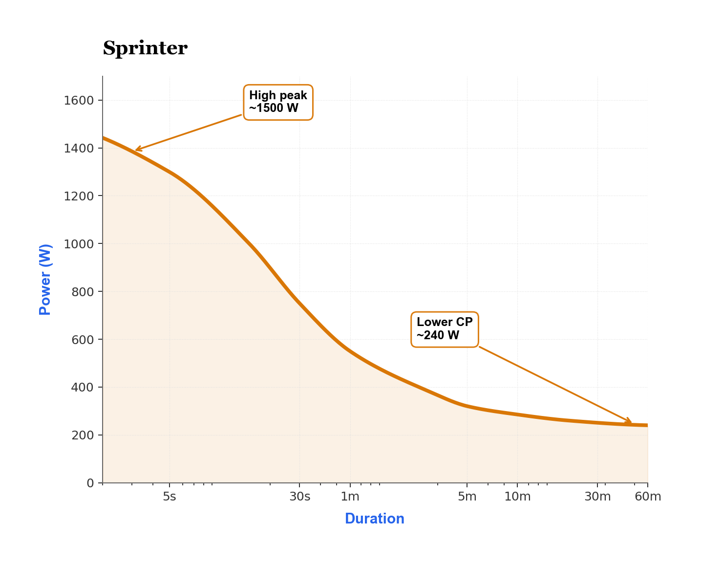
A sprinter's curve has a sharp peak at the left end (very high short-duration power) that drops off quickly toward the right. Their W′ is large, but CP is modest. They produce monstrous wattage for a few seconds, but can't hold it.
If your 5-second power is more than 4× your CP, you have sprinter physiology.
The time trialist
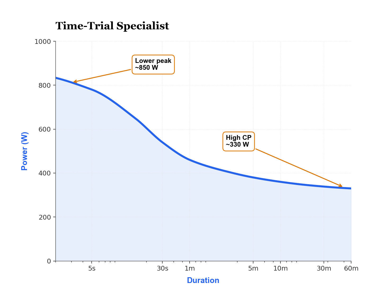
A TT specialist has a curve that's almost flat across the middle and right region. They hold power well across the 5 min to 60 min span. But the left end is suppressed: their 5-second sprint isn't much above their 1-minute power.
If your 1-minute power is less than 1.6× your CP, you have TT physiology.
The all-rounder
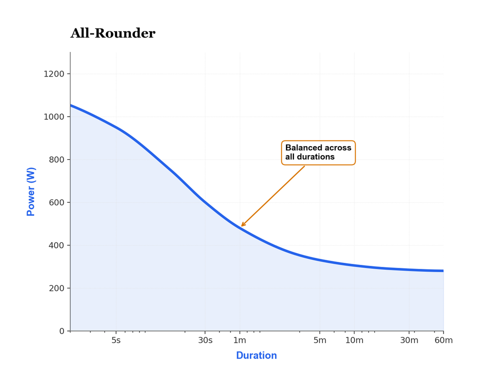
Most riders fall here. Moderate sprint, moderate aerobic capacity, moderate CP. The curve has a balanced slope, no dramatic peak on either side, and the pattern is the unsexy backbone of almost every finishing photo, the rider who can chase a break for ten minutes and still kick at the line. The pattern is unflashy. Useful in almost every kind of race.
What "good" looks like at each duration
Specific power-to-weight benchmarks vary, but here's a calibration sanity check at four durations:
| Duration | Recreational | Strong amateur | Elite |
|---|---|---|---|
| 5 s sprint | 14 W/kg | 18 W/kg | 22 W/kg |
| 1 minute | 6 W/kg | 8 W/kg | 11 W/kg |
| 5 minutes | 4 W/kg | 5 W/kg | 6.5 W/kg |
| 60 minutes (CP) | 3 W/kg | 4 W/kg | 5.5 W/kg |
Don't read these as targets. They're sanity checks. If your numbers are an order of magnitude off, suspect the meter first. Suspect your fitness second.
Gradescale: Your physiology, decoded. Join the waitlist now.
 Thomas Mortelmans
The two most common reading mistakes
Mistake #1: Confusing your best effort with your sustainable power. A single all-out 5-minute test gives you one data point on the curve. Your "true" 5-minute number is the highest you've held across many efforts, not your latest one.
Mistake #2: Reading the curve before you have enough data. A PDC built from 30 days of riding under-counts your true capability, because you probably haven't gone all-out at every duration. Roughly 90 days of varied intensity is the minimum for a curve that reflects your real physiology.
How to use the curve to plan training
The PDC isn't only a diagnostic. It's also a planning tool. Use it that way.
Your weakest region is where training pays off most. If you have a sharp peak on the left and a low CP, training for CP will produce the biggest gains in real-world performance. If you have a high CP but no sprint, neuromuscular work pays off most.
But your strengths matter too. They're how you win races. A sprinter who trains away their sprint to add 5 W of CP usually loses the only ace they had. Don't do that.
The right move is to train your weakness in the off-season and sharpen your strength in the build phase. The curve tells you which is which.
What changes as you train
Trained gains show up differently in different regions:
- Sprint power (≤ 15 s). Gains in months, with neuromuscular work and strength training. Highly trainable but with a hard ceiling set by genetics.
- VO2max (3–8 min). Fastest to gain, fastest to lose. Three weeks of well-designed intervals can produce visible gains. Three weeks of detraining can lose them.
- CP (30–60 min). Slowest to gain, slowest to lose. Months to years. A solid CP is the most durable adaptation in endurance cycling.
When you compare your PDC across seasons, look for which region moved most. That tells you what your training actually did. Not what you intended it to do.
Reading the curve when something is off
A PDC that doesn't match your race results is informative, and the mismatch usually points somewhere specific if you know how to read the gap between paper and pavement. Listen to it.
If your CP looks high but you can't finish a hard race, suspect fatigue resistance. Fresh CP looks fine. Under accumulated load it falls fast, sometimes by 20 to 40 watts in the back half of a long event, and the same curve plotted at fresh versus at 30 hours of accumulated work will tell you the real story your race already told you.
If your 5-minute power dropped 30 W since last year but your CP is unchanged, suspect VO2max detraining. Probably you stopped doing hard intervals.
If everything dropped in lockstep, suspect systemic fatigue or overtraining. The whole curve drops together when the body is under-recovered.
Why the curve is more honest than a single FTP
A single FTP number gives you an anchor for zones, but it tells you nothing about what kind of rider you are. Two athletes can have identical FTPs and entirely different PDCs. One a sprinter, one a diesel.
A 280-watt FTP says nothing about whether you can win a field sprint or chase down a breakaway. The PDC tells you both. At a glance.
That's why model-based platforms increasingly anchor zones on the power-duration curve rather than a single 20-minute test. The curve encodes more of your actual physiology.
How often to refresh your curve
A curve built from the last 90 days is the cleanest read on your current fitness. Older data drifts. It tells you who you were, not who you are.
Practical cadence: review the 90-day curve once per training block (every 4 to 6 weeks), and the 365-day curve at the start and end of each season. The 90-day view drives short-term decisions. The 365-day view shows you the trajectory.
The takeaway
Your power-duration curve is the most honest summary of your physiology you'll find on a single chart. Once you can read its shape, you stop guessing about what to train, and start training what the data actually says you should.
A few minutes a week reading your own curve will produce more training insight than a hundred hours of aimless intervals. Try it. The chart pays back the time fast.
Want to see your own curve, modelled with CP and W′ extracted? The free Gradescale account renders your PDC from any uploaded ride and updates it automatically as you train.
Found this useful?
Get articles like this and free training calculators in your inbox every week.
Recommended reads
If this was useful, these are the other research-driven newsletters I actually read.



Member discussion